All blog posts
Labelbox•December 20, 2022
Debugging models made easy with auto-computed metrics

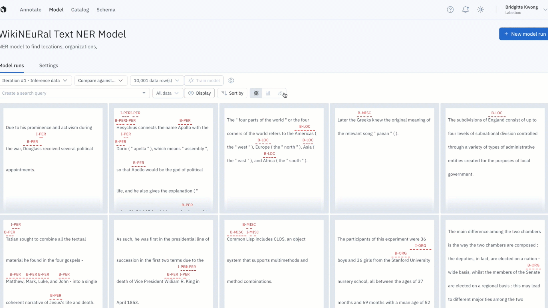
Recent product development on Labelbox Model focused on helping you ship better models faster. Rather than manually writing code to visualize predictions and ground truths on a data row in order to understand and piece together a pattern of model failures, Labelbox automatically helps surface model failures and labeling mistakes.
Read on to learn more about how you can debug your model with auto-generated metrics and better identify model errors with the updated projector view.
Surface model failures and labeling mistakes
Model metrics help you evaluate the performance of a model and allows you to quantitatively compare two models.
In the next week, we’ll be releasing auto-generated model metrics to debug your model, find and fix labeling errors, and improve the overall performance of your model before it hits production on real-world data.
Rather than asking users to manually compute and upload metrics, Labelbox Model automatically computes metrics on individual predictions.
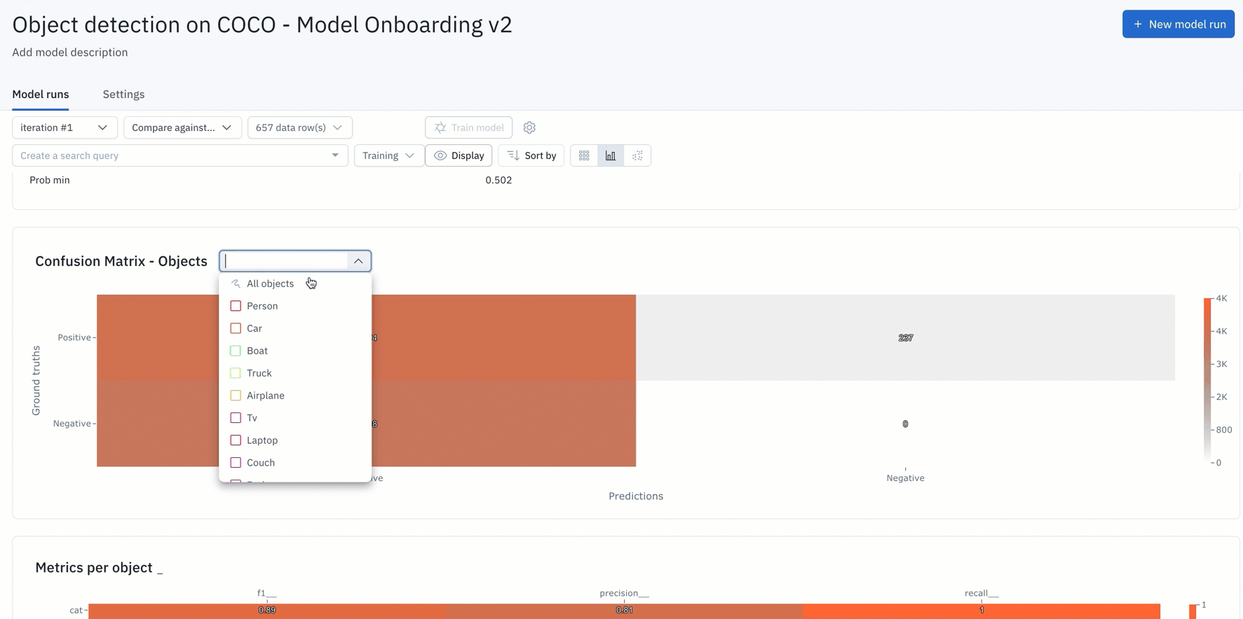
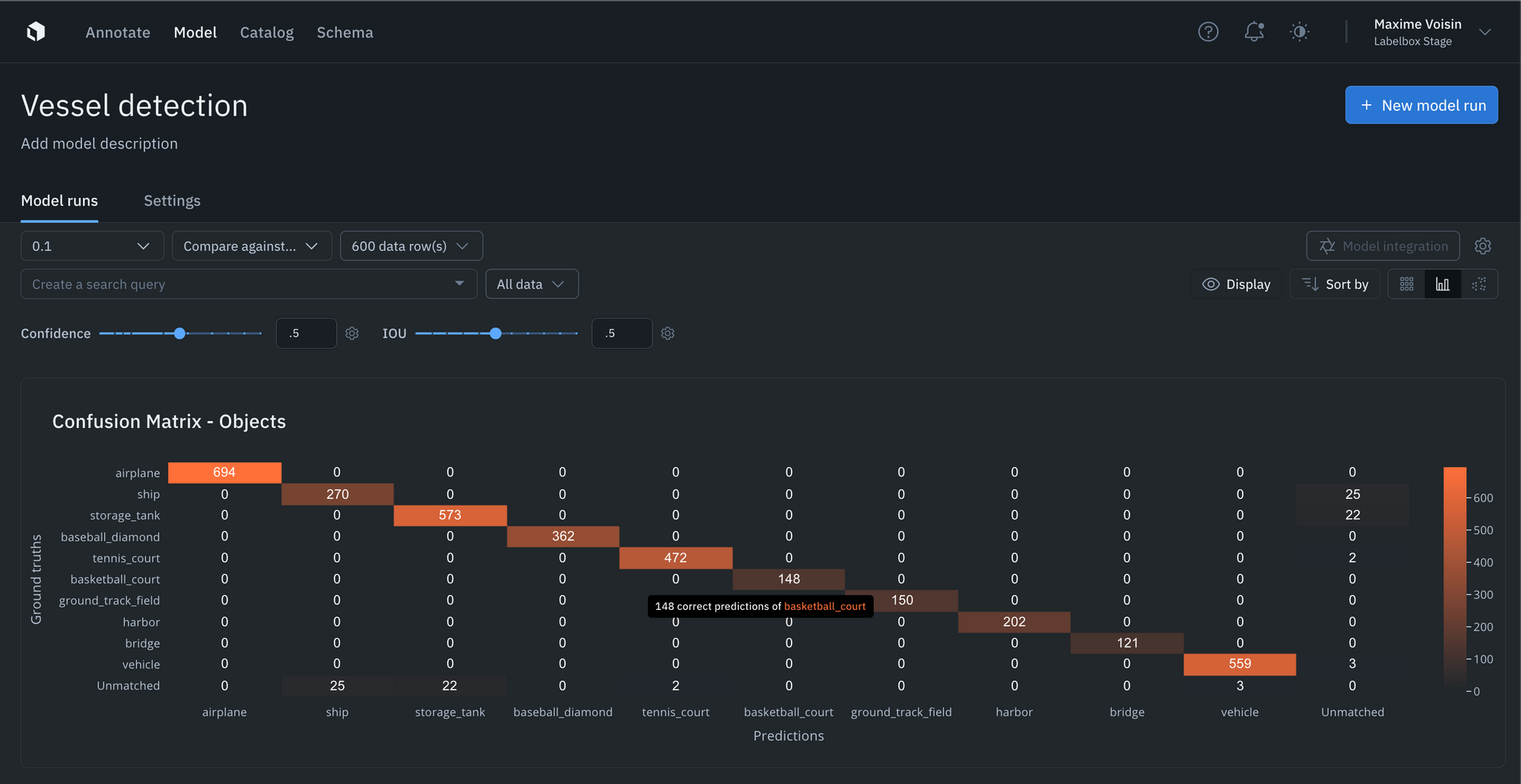
- You can simply upload your model predictions and ground truths to receive auto-generated metrics on model precision, recall, F1-score, TP/TN/FP/FN, and confusion matrix.
- If the auto-generated metrics aren’t sufficient for your use case, you can upload your own custom metrics as well.
- Visualize, filter, sort, and drill into your metrics, confidence scores, predictions, and annotations. This allows you to easily surface mispredictions, mislabeled data, and allows you to quickly identify improvements to your training data.
- You can interact and click into the NxN confusion matrix or click into the IOU / Precision / Recall histograms to surface and view specific data rows in “gallery view.” For instance, you can understand where your model is not performing well, where your labels are off, or where your mode is the least confident.
- Upload confidence scores alongside every prediction and tune the confidence and IOU thresholds in the Labelbox Model UI to see how model metrics change as the thresholds change.
Ready to get started?
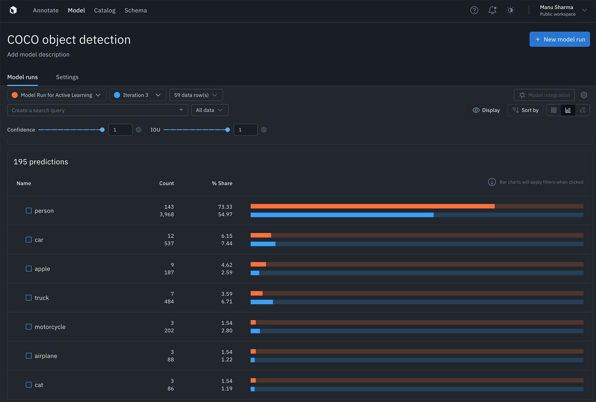
Find the distribution of annotations and predictions in every model run via histograms
Curating datasets for labeling and analyzing model performance is now easier than ever with readily available annotation distribution metrics. AI teams can use this information to find the most predicted or least-predicted class, as well as surface classes represented in training data, but are rarely predicted by the model.
Learn more about auto-generated metrics and analytics in our documentation.
Debug segmentation models faster than ever
You can now debug segmentation models faster than ever with native segmentation mask rendering.
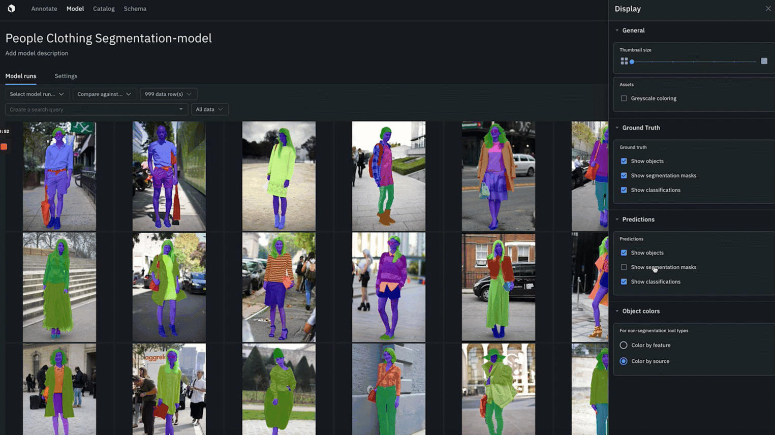
- Quickly identify where ground truth annotations and predictions agree or disagree to better spot model or labeling errors.
- You can color objects by feature or by source in both “gallery view” and “detailed view”
- Whenever segmentation masks are enabled for ground truth and predictions, you can toggle “agree” or “disagree” to color and quickly spot the overlap between ground truth and predictions.
Better identify model errors with the updated embedding projector
It can be difficult uncovering patterns and finding outliers in unstructured data. The embedding projector is a powerful tool for error analysis — uncover patterns in unstructured data that can be used to diagnose systemic model and labeling errors.
- The projector view supports 50k data points and is valuable in helping find patterns of model failures and labeling mistakes, finding outliers in your training data, and finding out of distribution data points.
- You can navigate and zoom into your data points interactively and use the selection tool to isolate clusters of data rows for further analysis. Clusters can be colored based on any filter, such as predictions, annotations, or metrics.
- Once you’ve identified a cluster of data points that you’d like to further investigate, you can view them in grid view for further inspection and can also visualize predictions and ground truths on data rows.
- The projector view allows you to easily view low IOUs and to visually investigate your data with projection methods to quickly uncover patterns and identify model and data improvements.
Learn more about the projector view in our documentation.