×![]()

 All blog posts
Jake Fleming•December 11, 2020
Our new look

Today, we are rolling out a brand new logo. While our customers are using AI to pursue ambitious new pursuits across a wide range of industries, we are building the most complete Training Data Platform to enable those breakthroughs. A well-built Training Data Platform should allow you to easily oversee all aspects of managing, annotating and iterating on the data that fuels your AI models. This logo update is meant to better represent the craftsmanship, reliability, and utility you expect out of Labelbox.

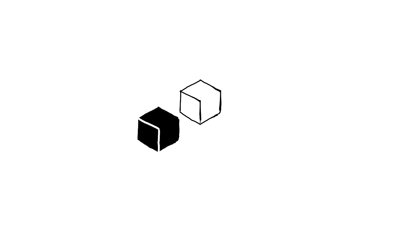
The humble box is beautifully simple, extremely versatile, and reliably used worldwide — all day, every day.
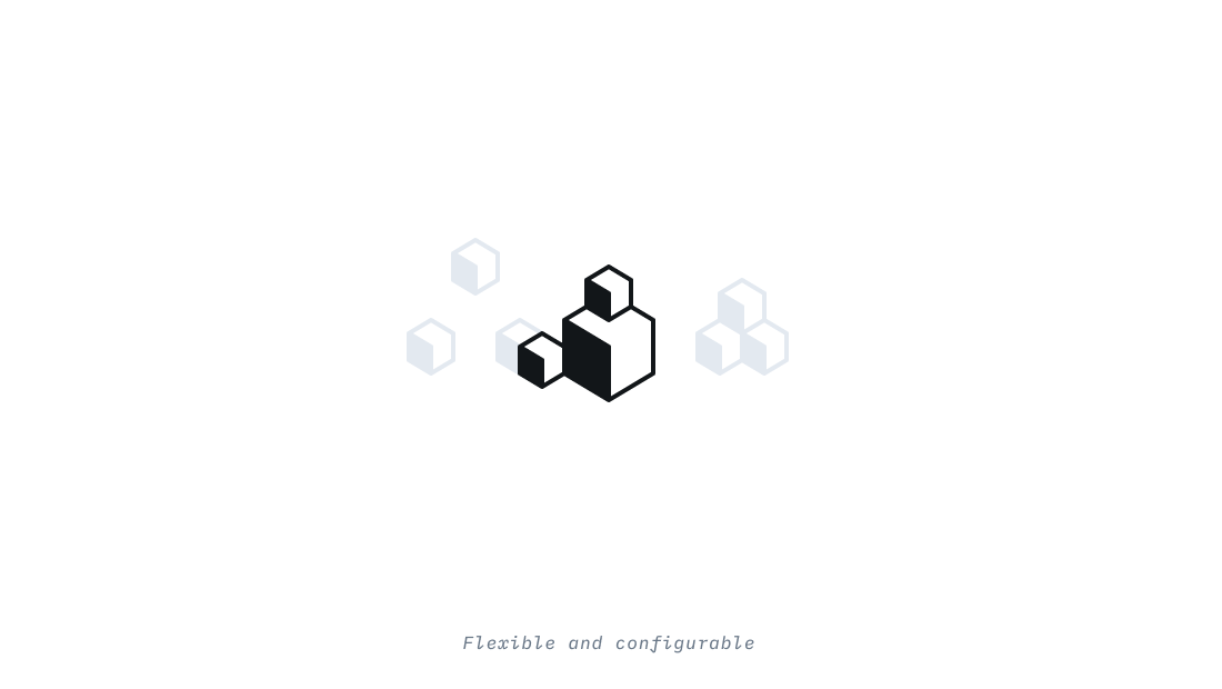
You probably have a box or two waiting at your doorstep right now. You might have a couple of boxes under your bed hidden away with your most valuable items — money, heirlooms, family photos. You, along with pretty much everyone else on the planet, trust boxes to hold your work, your life — your most precious things.

Since you're reading this, there's a good chance that you are the proud owner of a proprietary model — and all of the work that goes into managing and iterating on that model lives in Labelbox, your trusted, reliable partner.
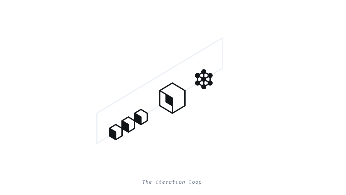
Labelbox is not just another step in your pipeline. It's what shortens your iteration loop and allows you to focus on what really matters: the myriad of complex problems your business is solving. Import your data, annotate it, manage it, and iterate.
Now that you've seen where we ended up and some of the reasons why we decided to refresh our brand, I'd love to share with you a glimpse into the process. Since our logo's job is to help our customers and potential customers identify Labelbox, it should be simple, memorable, and ownable. Our quest for those three attributes started with throwing a bunch of stuff at the wall until we had something that stuck.

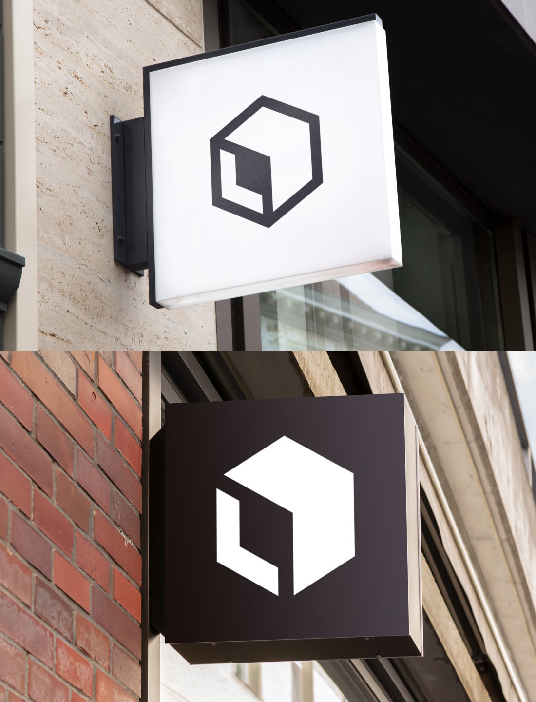
We were drawn to our final shape in part because of the different components hidden within it:
- The shape is an open 3-dimensional box - inviting you to fill it with valuables
- The open left side of the box forms an "L" - that's us!
- The right side forms a diagonal arrow up and to the right - the direction we know our customers want to see the performance and profitability of their models trend

We pushed a few options to high fidelity and tried them out for a couple of weeks in context. The team fell in love with the negative shape formed by the outlines, especially when on a dark background.
We even played around with a few animations to demonstrate the fun things the new direction would allow us to do.
We're excited about this new chapter in the Labelbox brand and we hope you are too. Find our new brand assets over on our Press & Media page.